Expanding Flighty into Travel Finance Management
App
Flighty
Role
UX Designer
Project type
Feature Addition
Duration
2 Weeks
Sector
Travel
Introduction
Flighty - Live Flight Tracker
Flighty is a sleek, real-time flight tracking app designed for frequent flyers and travel enthusiasts who crave control and calm during travel. With proactive delay alerts, live plane tracking, and personalized notifications, Flighty simplifies air travel by eliminating uncertainty — before you even reach the airport.

Phase 1: Tracking Ticket Costs in Local Currency
Core Problem
Flighty users, including myself, have identified a gap in the app: the inability to log and track flight expenditures. Significant user demand for this feature is evident on platforms like the r/flighty subreddit, driven by needs for financial oversight or the simple desire for more comprehensive travel statistics.
User Feedback
To gauge initial user reaction to a potential solution, I shared concept screenshots of this proposed cost tracking feature on the r/flighty subreddit. The post quickly garnered over 50 upvotes and positive comments, indicating a strong community interest in this specific design direction.
"Damn, so nerdy. I love it."
"I would love to see this feature - I currently use excel to track my costs in a similar fashion but it’s a very manual process I’d like to smooth out one day"
"Love it! Hopefully the devs will get this on the app"
Solution
The solution introduces two core components integrated into the Flighty interface to enable cost tracking:
- A dedicated cost input field within the flight details view, allowing users to optionally log the price paid and currency for each flight.
- A new 'Total Costs' statistics section within the Flighty Passport, designed to aggregate and display spending data (including totals, averages per trip type, and extremes) in a format consistent with existing flight statistics.
Design
Flight details screen
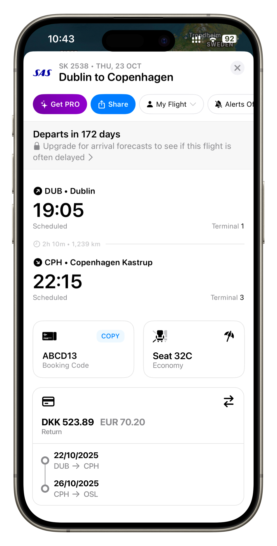
Maintaining Flighty's clean and consistent design language was a primary goal, prioritizing the reuse of existing components where possible. The flight details screen features a two-column layout for elements like 'Booking Code' and 'Seat'. Introducing a single new 'Cost' card within this structure presented a layout challenge, as it would disrupt the established visual balance.

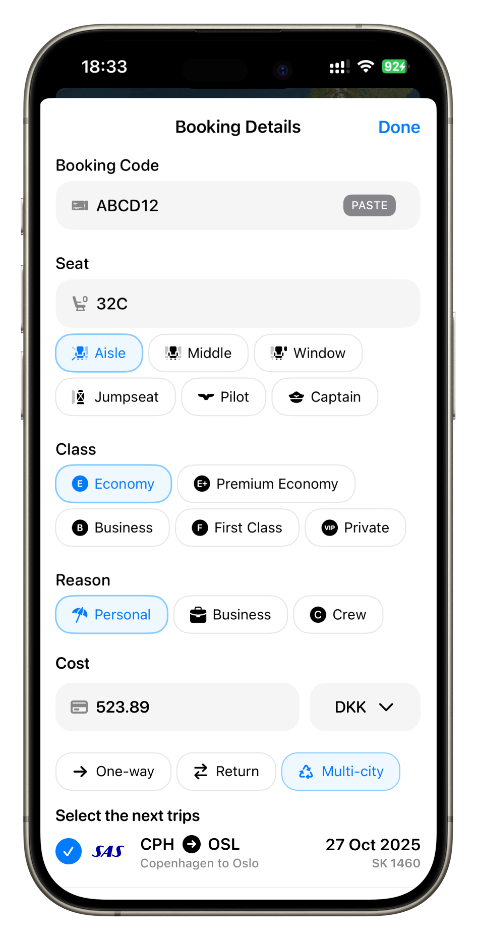
Booking Details
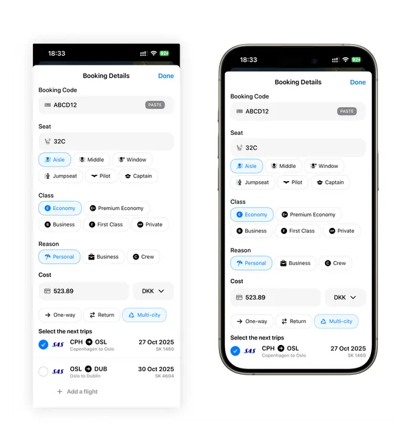
Integrated within the "Booking Details" sheet, the cost input functionality allows users to optionally log an amount and select the original purchase currency. Segmented controls then enable classification as 'One-way', 'Return', or 'Multi-city'. This trip type dictates the subsequent flight linking: 'Return' costs are associated with a selected return flight (often auto-suggested), and 'Multi-city' costs can be linked by the user to all relevant flight segments from a single payment.
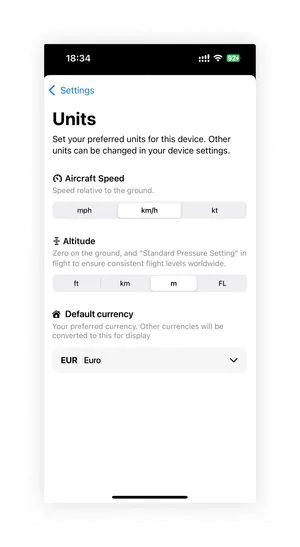
Display Currency
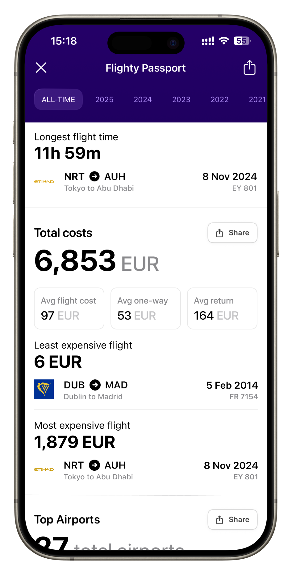
To handle costs entered in various currencies, a 'Display Currency' setting was introduced under 'Units' in the app settings to allowed users to select their preferred currency. This selection ensures consistency across the app: costs logged in other currencies will show their converted value in the user's preferred currency, and all statistics in the Flighty Passport's 'Total Costs' section will be presented uniformly in this chosen currency.
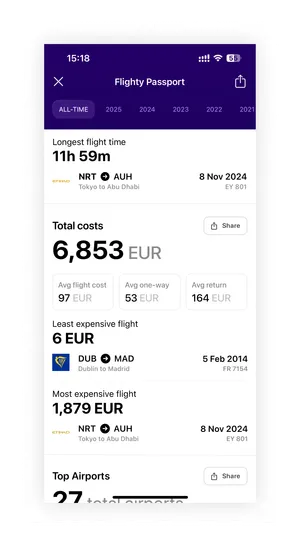
Flighty Passport - Total costs
A new 'Total Costs' section was introduced within the Flighty Passport, strategically placed between the existing 'Flight Time' and 'Top Airports' sections to group primary travel metrics together. This section provides users with aggregated insights into their flight spending
Phase 2: Tracking Frequent Flyer Miles
Core Problem
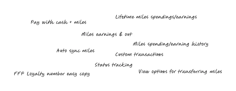
Users don't have a way to track their miles and miles spendings in the Flighty app. Users want to be able to add their miles spendings in the app made for their flights like Flighty, rather than a seperate app or spreadsheet. Many trips are payed for with cash + miles and miles can be spent on extras like inflight WiFi. Users want to be able to track their income and outcome of miles.
By adding the feature of basic miles tracking into Flighty, we can reduce the need for a separate miles track app. AwardWallet currently has over 100,000 downloads on the Play Store and over 2,800 ratings on the app store showing the vast amount of users who value this feature.
Solution
Integrate frequent flyer programme support into Flighty, allowing users to easily track their miles earned and spent, and view a comprehensive transaction history.
Analysis
In May, I shared UI designs for tracking flight costs and differentiating between one-way, return, and multi-city bookings, following feedback from a previous post requesting such a feature. The post gained significant attention with over 44,000 views. However, feedback from both posts consistently highlighted one missing element: the ability to track flight costs booked with miles and to monitor miles earned and spent.
While similar services exist for automatic miles tracking like AwardWallet, they require users to install another app dedicated solely to points management. My goal is to integrate mile tracking into Flighty, eliminating the need for a separate app.
AwardWallet currently has over 100,000 downloads on the Play Store and over 2,800 ratings on the app store showing the vast amount of users who value this feature.
"I would love to see this feature - I currently use excel to track my costs in a similar fashion but it’s a very manual process I’d like to smooth out one day"
"Yes! And some kind of point & rank tracking"
"This and a system for tracking points spend (by airline)"
User Flow
Outcome
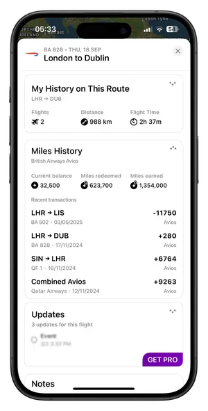
Miles History
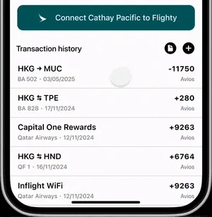
A Miles History card has been added to the bottom of the flight overview page. This card shows the current miles balance for the frequent flyer programme associated with the airline as well as the lifetime miles redeemed and earned. For the miles icon I used a filled circle with a white star inside which gives it a “points” kind of look. I decided to use arrows in the top right one pointing up indicating miles redeemed and the other pointing down indicating miles earned.
The user can expand the card to see the recent miles history on the same programme. The history shows any transactions added to the programme via manual transaction or the auto syncing feature.
A new Miles History card has been added to the bottom of the flight overview page, displaying the user's current miles balance for the airline's frequent flyer programme, along with their lifetime miles earned and redeemed totals.

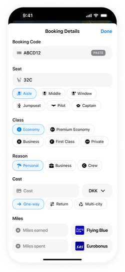
Booking Details
At the bottom of the booking details, I’ve added a miles section where users can enter the miles earned and miles spent. Both inputs allow the user to select which frequent flyer programme was used for the transactions as flyers can pay with one programme but earn miles on another.
I used a filled circle with a white star, making it intuitive as a "points" or "miles" indicator. I added an upward pointing arrow to signify miles redeemed (or going out) and downward pointing arrow to signify miles earned (or coming in).
The card is expandable, allowing users to view their recent miles transaction history within the same programme. This history includes up to 8 of the most recent transactions.
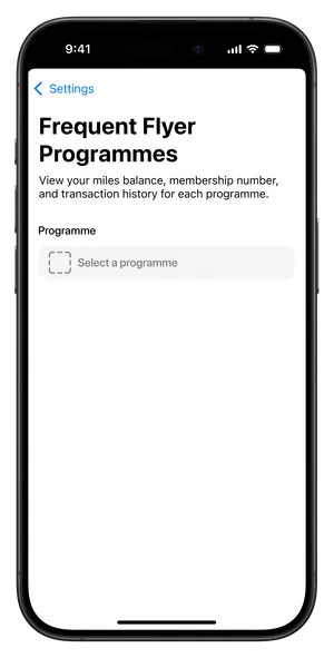
Frequent Flyer Programmes Settings
The setting for this is available under the automations section as it feature a self syncing miles option. On this page, the user can select an airline just like in the booking details. When the programme is selected, the current miles balance is displayed on the right side of the selection box. Below, users can paste in their frequent flyer number allowing them to keep all their numbers organized in one place within the app. This avoids the hassle of visiting airline websites and having to repeatedly log in. By adding their frequent flyer number to Flighty, users gain convenient access to see their number and easily copy it with the one click "Copy" button.
Users also have a choice to connect their airline accounts to Flighty, which enables Flighty to automatically sync the miles balance and transaction history. This automation saves time and effort, especially for those with airline credit cards, by keeping their miles information up to date. The feature ensures that the full history of the users miles is synced, including flight redemptions, inflight extras, earned miles, and transfers to other airlines. This provides an entirely automated way to keep miles accurate and up-to-date.
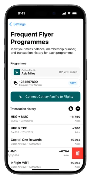
Security Concerns
Since frequent flyer numbers are sensitive, a key consideration for this concept is security. In this design, miles syncing is envisioned to happen on-device rather than on Flighty's servers. This approach, inspired by services like AwardWallet and Beeper, would reduce privacy concerns and build user trust by keeping data under the user's control.
Transactions
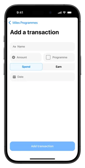
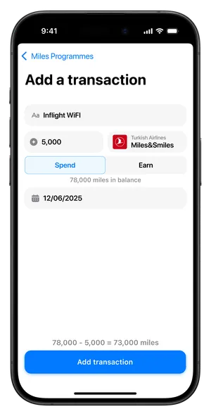
For users who prefer to manage their miles manually, a dedicated "Add Transaction" button is available in the history section. Users can tap any transaction to edit its details or swipe left to delete it.
When adding or editing a transaction, users can input key details such as the transaction name, amount spent, the frequent flyer programme used (defaulting to the programme already selected), whether miles were spent or earned, and the transaction date. Just above the confirmation button, a preview displays the updated miles balance after the transaction.
An "Export Transactions" button is also provided. This feature can automatically generate a PDF or CSV file with all transaction records, offering advanced management for users who require it.
Programme Selection
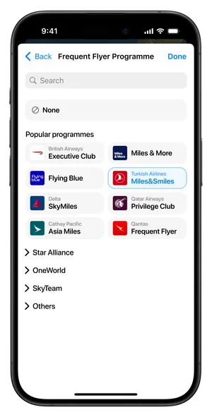
The frequent flyer programme selection uses a personalized approach to streamline the user experience. The interface dynamically adapts its content based on whether users have previously selected programmes, showing the most relevant options first.
New Users
New users see "Popular programmes" at the top, displaying the most commonly selected frequent flyer programmes. This helps users flying popular airlines find options quickly and reduces decision paralysis by presenting curated, popular choices that are most likely to be relevant.
Existing Users
Returning users see "Previously used programmes" at the top, showing programmes they have assigned to flights before. This streamlines the experience for users who often fly the same airlines by providing personalized shortcuts to their familiar programmes.
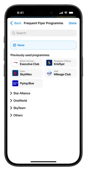
For selecting an airline’s frequent flyer programme, I designed a two-column list, grouped by alliance and an “Others” section. Each programme displays the airline or programme logo, the airline name (unless the programme covers multiple airlines, such as Miles & More), and the programme name.
Additionally, a search feature is included, allowing users to find their airline by name regardless of alliance grouping. This is especially helpful if they are unsure of the alliance or prefer to search directly.
Results
I made a post on the r/flighty subreddit sharing this miles tracking concept, which received positive feedback from the community. Users were enthusiastic about the idea and expressed genuine interest in having this functionality added to the app.
However, I made a mistake by not sharing enough implementation details in the post, particularly about how the miles syncing feature would happen on-device rather than through Flighty's servers. This oversight led to several comments raising security concerns about sharing frequent flyer program numbers, since users weren't aware of the privacy-focused approach I had designed.
Next Steps
Implementing a frequent flyer status tracking system. While the idea existed in the brainstorming phase, I decided to exclude it and instead focus on enhancing the core experience through the addition of the "Cost Tracking" update.